SVGで線文字を動かしてみる

今日の記事はWEBデザインに関する記事です!
(WEBに興味のない方はごめんなさい…)
思いつきでチャレンジしてみました。
作るのはこういう↙SVGアニメーションです。
DEMO
1)まずIllustrator上で適当なタイトルロゴを作る

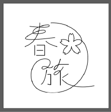
こんなかんじ…?
Illustratorなどで、線画オブジェクトのパスで描画しましょう。
完成したらSVG形式で保存します。
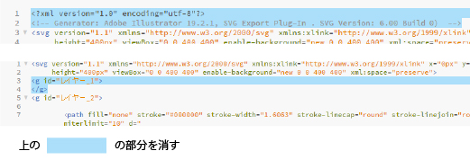
2)SVGをテキストエディターで開き編集する

いらないコードが含まれているので、それを消していきます。
1)<svg></svg>以外のコードを消す
2)空のレイヤーを消す
3)<svg>の中にはwidht=”(数字)” height=”(数字)のみ入れる(単位はpxになります)。
3)SVGを配置したいHTMLを開いて編集したSVGコードをペースト
imgタグでSVGファイルをリンク配置するのではなく、コードとしてHTML内に書き入れましょう。
こんな感じ…
<html>
<head>...</head>
<body>

<!--ここからSVG-->
<svg width="500" height="500">
<g id="haru-logo">
<path class="haru-01" fill="none" stroke="#000000" stroke-width="1.6063" stroke-linecap="round" stroke-linejoin="round" stroke-miterlimit="10" d="M100.3,87.1c0,0,79.5,9.6,73.9-3.3c-2.6-5.9-59.9,4.8-62.6,26.9c-1.2,9.6,46,4.2,48.2-3.2c2.8-9.6-30.5-8-70.9,19.3 c-34.1,23,107.4,3.1,107.4,3.1"/>
<path fill="none" stroke="#000000" stroke-width="1.6063" stroke-linecap="round" stroke-linejoin="round" stroke-miterlimit="10" d="M138.4,74.3c0,0,3.2,67.6-56.2,90.5"/>
<path fill="none" stroke="#000000" stroke-width="1.6063" stroke-linecap="round" stroke-linejoin="round" stroke-miterlimit="10" d="M162.5,144.4c0,0,9.8,12.3,41,20.4"/>
<line fill="none" stroke="#000000" stroke-width="2" stroke-linecap="round" stroke-linejoin="round" stroke-miterlimit="10" x1="119" y1="160.2" x2="119" y2="197.2"/>
<polyline fill="none" stroke="#000000" stroke-width="2" stroke-linecap="round" stroke-linejoin="round" stroke-miterlimit="10" points="128,159.2 157,159.2 157,198.2 126,198.2"/>
<line fill="none" stroke="#000000" stroke-width="2" stroke-linecap="round" stroke-linejoin="round" stroke-miterlimit="10" x1="128" y1="179.2" x2="150" y2="179.2"/>
<path fill="none" stroke="#000000" stroke-width="1.6063" stroke-linecap="round" stroke-linejoin="round" stroke-miterlimit="10" d="M180.8,74.3c0,0,62.1-5.3,102.7,40.2c36.9,41.3-10.2,46.6-10.2,46.6c3.4,1.6,6.6,3.8,9.3,6.7c5,5.2,8,11.6,8.9,18.2 c-2.2-0.4-4.3-0.5-6.5-0.4c-0.1,2.2,0,4.4,0.2,6.5c-6.6-1.1-12.9-4.2-18-9.4c-5-5.1-7.9-11.4-8.9-18c-0.4,6.6-2.8,13.2-7.3,18.7 c-4.6,5.6-10.6,9.2-17.1,10.9c0.1-2.2,0-4.4-0.3-6.5c-2.2,0.1-4.3,0.4-6.5,1c0.3-6.7,2.7-13.3,7.3-18.9c2.9-3.5,6.3-6.2,10.1-8.2 c-4.2,0.2-8.6-0.4-12.8-1.9c-6.8-2.5-12.2-7-15.9-12.6c2.1-0.6,4.1-1.4,6.1-2.4c-0.8-2-1.9-4-3.1-5.8c6.4-1.9,13.5-1.8,20.3,0.7 c4.1,1.5,7.7,3.8,10.7,6.5c-1.6-3.8-2.4-8-2.4-12.3c0-7.2,2.4-13.9,6.3-19.3c1.3,1.8,2.8,3.4,4.4,4.9c1.6-1.5,3.1-3.1,4.4-4.9 c4,5.4,6.3,12.1,6.3,19.3c0,3.9-0.7,7.7-2,11.2c0,0,34.1-30.4,51.9,36.3c0,0,15.6,58.1-27.2,110c0,0-33.5,45.5-95.4,49.2 c-20.5,1.2-34.8-1.2-47.7-5.6c-19.6-6.8-34.4-19-40.1-39c-3.9-13.8-6.2-34.9,5.1-56.2c23.3-44.1,87.1-32.2,56.6,2 c0,0-18.6,14.5-23.7,6c-2.4-4,4.6-11.9,25-2.9c0,0,11.8,2.5,17.1-5.5"/>
<path fill="none" stroke="#000000" stroke-width="1.6063" stroke-linecap="round" stroke-linejoin="round" stroke-miterlimit="10" d="M164.5,253.8c0,0-4.8,44.8-20.5,53.7"/>
<polyline fill="none" stroke="#000000" stroke-width="2" stroke-linecap="round" stroke-linejoin="round" stroke-miterlimit="10" points="168,270.2 180,270.2 180,309.8 168.4,307.3 "/>
<path fill="none" stroke="#000000" stroke-width="2" stroke-linecap="round" stroke-linejoin="round" stroke-miterlimit="10" d="M216.7,212.4c0,0-7.1,30.1-20.4,39.4c-8.1,5.6-3.7-20.6,24.4-19.6H248"/>
<path fill="none" stroke="#000000" stroke-width="1.6063" stroke-linecap="round" stroke-linejoin="round" stroke-miterlimit="10" d="M227.3,242.4c0,0-4.7,11.4-23.9,26.5c-3,2.4-8.7,4.8-10.8,1.6c-3-4.6,6.4-10,15.4-13.5c8.6-3.3,9,2.4,8.6,11v43.4"/>
<path fill="none" stroke="#000000" stroke-width="1.6063" stroke-linecap="round" stroke-linejoin="round" stroke-miterlimit="10" d="M246,268.1c0,0-21.3,14.9-20.9,14.5"/>
<path fill="none" stroke="#000000" stroke-width="1.6063" stroke-linecap="round" stroke-linejoin="round" stroke-miterlimit="10" d="M223.5,289.8c0,0,29.3,42.2,121.3,24.1"/>
</g>
</svg>
<!--ここまで-->
</body>
</html>
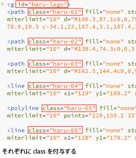
この<line><path><polyline>というのがベジェパスです。
それぞれのパスにclassを付与します。
<g>はグループです。こちらはidをつけておきましょう。
SVGには「fill(塗りつぶし色)」「stroke(線の色)」などの様々な属性が設定されていますが、それらはすべてCSSのプロパティとして変更することが可能です。
例:
<path class="img1" fill="none" stroke="#000" d="..."/>
+
.img1{
fill:#fff;/*塗りつぶし色を白に*/
stroke="#ccc"/*線の色をグレーに*/
}
↓
<path class="img1" fill="#fff" stroke="#ccc" d="..."/>
便利ですね!
CSS慣れしている人には何の苦も無いのではないでしょうか。
ただし、通常のCSSプロパティとSVGの属性は異なりますので注意が必要です。
(ふつうのCSSプロパティ指示をしても意図したように反映されません)
先程のHTMLに貼り付けたSVGコードですが、よりコードを短くするため、一括してCSSで管理したいと思います。そのため、それぞれの要素内の「fill、stroke、stroke-width、stroke-linecap、stroke-linejoin、stroke-miterlimit」はひとまず消して、CSS上でまとめて表記します。
こんなに短くなったよ↓
HTML
<svg width="500" height="500">
<g id="haru-logo">
<path class="haru-01" d="M100.3,87.1c0,0,79.5,9.6,73.9-3.3c-2.6-5.9-59.9,4.8-62.6,26.9c-1.2,9.6,46,4.2,48.2-3.2c2.8-9.6-30.5-8-70.9,19.3 c-34.1,23,107.4,3.1,107.4,3.1"/>
<path class="haru-02" d="M138.4,74.3c0,0,3.2,67.6-56.2,90.5"/>
<path class="haru-03" d="M162.5,144.4c0,0,9.8,12.3,41,20.4"/>
<line class="haru-04" x1="119" y1="160.2" x2="119" y2="197.2"/>
<polyline class="haru-05" points="128,159.2 157,159.2 157,198.2 126,198.2"/>
<line class="haru-06" x1="128" y1="179.2" x2="150" y2="179.2"/>
<path class="haru-07" d="M180.8,74.3c0,0,62.1-5.3,102.7,40.2c36.9,41.3-10.2,46.6-10.2,46.6c3.4,1.6,6.6,3.8,9.3,6.7c5,5.2,8,11.6,8.9,18.2 c-2.2-0.4-4.3-0.5-6.5-0.4c-0.1,2.2,0,4.4,0.2,6.5c-6.6-1.1-12.9-4.2-18-9.4c-5-5.1-7.9-11.4-8.9-18c-0.4,6.6-2.8,13.2-7.3,18.7 c-4.6,5.6-10.6,9.2-17.1,10.9c0.1-2.2,0-4.4-0.3-6.5c-2.2,0.1-4.3,0.4-6.5,1c0.3-6.7,2.7-13.3,7.3-18.9c2.9-3.5,6.3-6.2,10.1-8.2 c-4.2,0.2-8.6-0.4-12.8-1.9c-6.8-2.5-12.2-7-15.9-12.6c2.1-0.6,4.1-1.4,6.1-2.4c-0.8-2-1.9-4-3.1-5.8c6.4-1.9,13.5-1.8,20.3,0.7 c4.1,1.5,7.7,3.8,10.7,6.5c-1.6-3.8-2.4-8-2.4-12.3c0-7.2,2.4-13.9,6.3-19.3c1.3,1.8,2.8,3.4,4.4,4.9c1.6-1.5,3.1-3.1,4.4-4.9 c4,5.4,6.3,12.1,6.3,19.3c0,3.9-0.7,7.7-2,11.2c0,0,34.1-30.4,51.9,36.3c0,0,15.6,58.1-27.2,110c0,0-33.5,45.5-95.4,49.2 c-20.5,1.2-34.8-1.2-47.7-5.6c-19.6-6.8-34.4-19-40.1-39c-3.9-13.8-6.2-34.9,5.1-56.2c23.3-44.1,87.1-32.2,56.6,2 c0,0-18.6,14.5-23.7,6c-2.4-4,4.6-11.9,25-2.9c0,0,11.8,2.5,17.1-5.5"/>
<path class="haru-08" d="M164.5,253.8c0,0-4.8,44.8-20.5,53.7"/>
<polyline class="haru-09" points="168,270.2 180,270.2 180,309.8 168.4,307.3 "/>
<path class="haru-10" d="M216.7,212.4c0,0-7.1,30.1-20.4,39.4c-8.1,5.6-3.7-20.6,24.4-19.6H248"/>
<path class="haru-11" d="M227.3,242.4c0,0-4.7,11.4-23.9,26.5c-3,2.4-8.7,4.8-10.8,1.6c-3-4.6,6.4-10,15.4-13.5c8.6-3.3,9,2.4,8.6,11v43.4"/>
<path class="haru-12" d="M246,268.1c0,0-21.3,14.9-20.9,14.5"/>
<path class="haru-13" d="M223.5,289.8c0,0,29.3,42.2,121.3,24.1"/>
</g>
</svg>
CSS
#haru-logo path,#haru-logo line,#haru-logo polyline
/*haru-logoというidの中の「path」「line」「polylone」要素すべてに適用*/
{
fill:none;
stroke:#000000;
stroke-width:2;
stroke-linecap:round;
stroke-linejoin:round;
stroke-miterlimit:10;
}
4)stroke-dasharrayとstroke-dashoffsetを使ってアニメーションにしてみよう
それではさっそくstroke-dasharray(破線の間隔)とstroke-dashoffset(破線の開始位置)というSVGの属性と、CSSのanimationプロパティ、@keyframeを使って、アニメーションにしていきましょう。
詳しいことは書きませんが、ようするに線分0%の状態(白紙)から、線分100%の状態(描画済み)へと変化させるというしくみです。
線分の終点位置(stroke-dashoffset)を線分100%の位置に持ってくることで、あたかもその点から線が「伸びているように」見えます。
そのため、stroke-dasharrayとstroke-dashoffsetは同じ値で、大きい数字(今回は5000)を入れておきます。
CSS
#haru-logo path,#haru-logo line,#haru-logo polyline
/*haru-logoというidの中の「path」「line」「polylone」要素すべてに適用*/
{
stroke-dasharray: 5000;
stroke-dashoffset:5000;
fill:none;
stroke:#000000;
stroke-width:2;
stroke-linecap:round;
stroke-linejoin:round;
stroke-miterlimit:10;
animation: RUN 5s linear forwards;
-webkit-animation: RUN 5s linear forwards;
}

@keyframes-webkit-keyframes RUN {
0%{stroke-dashoffset:5000;}
100%{stroke-dashoffset:0;}
}
@-moz-keyframes RUN{
0%{stroke-dashoffset:5000;}
100%{stroke-dashoffset:0;}
}
@-webkit-keyframes RUN{
0%{stroke-dashoffset:5000;}
100%{stroke-dashoffset:0;}
}
これを実行してみます。
下の「Result」をクリックしてください。
See the Pen
step1 by Nanae Matsumoto (@tekuteku-sanpo-nana)
on CodePen.
いい感じです!!
あとはそれぞれのパスのアニメーションが始まるタイミングを、animation-delay(読み込んでから開始するまでの時間)プロパティで設定していきます。
ただし、animationとanimation-delayは並べて表記する必要があるため、まとめて指定していたanimationプロパティは消して、それぞれのclassに書き直します。
CSS
#haru-logo path,#haru-logo line,#haru-logo polyline
/*haru-logoというidの中の「path」「line」「polylone」要素すべてに適用*/
{
stroke-dasharray: 5000;
stroke-dashoffset:5000;
fill:none;
stroke:#000000;
stroke-width:2;
stroke-linecap:round;
stroke-linejoin:round;
stroke-miterlimit:10;
/*animationプロパティ消す*/
}
.haru-01{
animation: RUN 5s linear forwards;
-webkit-animation: RUN 5s linear forwards;
}
.haru-02{
animation: RUN 5s linear forwards;
-webkit-animation: RUN 5s linear forwards;
animation-delay: 0.5;
-webkit-animation-delay: 0.5s;
-moz-animation-delay: 0.5s;
}

...(.haru-03~.haru-12は省略)...

.haru-13{
animation: RUN 5s linear forwards;
-webkit-animation: RUN 5s linear forwards;
animation-delay: 4s;
-webkit-animation-delay: 4s;
-moz-animation-delay: 4s;
}

@keyframes-webkit-keyframes RUN {
0%{stroke-dashoffset:5000;}
100%{stroke-dashoffset:0;}
}
@-moz-keyframes RUN{
0%{stroke-dashoffset:5000;}
100%{stroke-dashoffset:0;}
}
@-webkit-keyframes RUN{
0%{stroke-dashoffset:5000;}
100%{stroke-dashoffset:0;}
}
下の「Result」をクリックしてください。
See the Pen
pBpmvO by Nanae Matsumoto (@tekuteku-sanpo-nana)
on CodePen.
できた…!楽しい!
こんなふうに色々とアレンジしてみてくださいね。